Earn the shelf.
The identity for The Auto SKUS Group: the mark, the colors, the type and the rules that keep them consistent. Everything here is free to use for partners, press and vendors working on our behalf.
One system. Every surface.
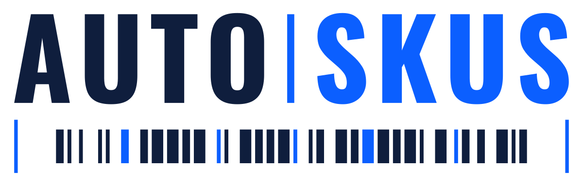
The wordmark is the anchor. AUTO in Deep Navy, a vertical Electric Blue divider, SKUS in Electric Blue, sitting above a barcode baseline. That baseline is the shelf edge, and it is the whole idea of the business in one graphic device.


Secondary lockups



Single color and special use













No typography. The motif alone, legible down to 16px. Raster sizes in the favicon set below.
It scans.
The baseline is not decoration. It is a valid Code 128 symbol encoding AUTOSKUS, with a start character, a checksum, a stop pattern and proper quiet zones. Point a scanner at the logo and it reads the company name back.
- The barcode is width matched to the wordmark by construction. Its module size is derived by dividing the measured wordmark width, so the two can never drift out of alignment.
- Light background marks scan. Reversed marks do not. White bars on navy is an inverted symbol and standard laser readers will not decode it. That is normal. If a piece needs to scan, use a light variant.
- Never specify the amber lockup where scanning matters. Signal Amber reflects red light, so a laser scanner reads amber bars as white and the symbol breaks, even though a phone camera may still decode it.
- Below roughly 280px wide the symbol stops scanning, well before it stops looking correct. Size accordingly when the scan is the point.
Disciplined blue, one surprise.
Two colors carry the identity. The third exists to be used rarely enough that it still means something when it appears.
Primary. Type, surfaces, the wordmark's first half.
Accent. The second half of the wordmark, links, calls to action.
Campaign only, used sparingly. Never a third brand color.
The default ground. The identity is built for light surfaces.
One pairing to avoid: Electric Blue text on Deep Navy measures 3.22 to 1. That clears the bar for large display type and for graphical elements, but it fails for body text. On dark surfaces set text in white and let the divider stay blue.
Four typefaces. One voice.
Condensed display type for the mark and headings, a workhorse sans for everything a buyer actually reads, and a mono for the numbers that carry the argument.
The short list.
Most of what goes wrong with an identity goes wrong in a hurry, in someone else's file, at the end of a day. These are the rules worth remembering.
- 01Never re-typeset the wordmark. Every mark here is outlined vector. If you set AUTO SKUS in live type it will render differently on every machine, which is exactly the fault this version was built to fix.
- 02Below 180px wide, drop the barcode and use the wordmark only. The bars close up and turn to mush.
- 03Clear space is already inside each file. Do not crop it out. The quiet zones the scanner needs live in that space.
- 04Amber is campaign only. It is not a third brand color and it is not an alternate primary.
- 05In running text the company is written AutoSKUs. The all caps lockup is the logo, not the spelling.
- 06Do not recolor, rotate, outline, add effects to, or place the mark on a busy photograph.
Everything, in one place.
Every mark in every format. SVG is what a printer, a signage vendor and a browser all want, so take that unless something rejects it. PNG is there for the platforms that do.
Individual marks
Favicon set
Drop the whole set at the site root. The SVG covers modern browsers, the ICO is the fallback, and the two large PNGs are what phones use when someone adds the site to a home screen.


Email signatures
Gmail and Outlook signature editors cannot render SVG, and they need a public URL rather than an uploaded file. Paste one of these. Use the wordmark, not the full lockup: at signature scale the barcode closes up and turns to mush.
https://www.autoskus.com/brand/exports/auto-skus-wordmark-light-600.pngThat is the 2x asset, so it stays sharp on a retina screen. Set the display width in the signature editor, not the file. If your client sends on a navy or black template, swap -light- for -dark-.
One caveat worth knowing: the light file has a transparent background, so on a recipient reading in dark mode the navy half of the wordmark can go nearly invisible. There is no fix that works everywhere. If that matters more than looking clean on white, use the dark file, which carries its own navy plate.
LinkedIn kit
Company page covers are 1128 by 191. The mark is centred rather than left aligned, because LinkedIn overlays the profile logo on the lower left of a cover and mobile crops covers from the centre. Take the 2x file: LinkedIn scales it down and it stays sharp.








The marks are generated, not hand drawn. Change one parameter and every variant regenerates in agreement, which is what stops a kit drifting apart over time. The rasters on this page are produced from the same SVG masters, so they cannot fall out of step with them either.
Questions, exceptions, or a placement not covered here: get in touch.